
Have an important presentation coming up, but can’t afford to hire PowerPoint experts to help you? Whether you’re seeking investment capital, new clients or a new employer, it’s important that any presentation that you use conveys your brand and professionalism. Here are some simple ways that you can make your presentation, pitch deck, or PowerPoint look like it was professionally designed!
One of the most impactful things you can do to make your PowerPoint or Keynote Presentation look professionally designed is to stop using bullets. It’s so easy to click the button and put a few thoughts down on paper, almost without any effort. But repetitive, boring bullet slides are part of what give PowerPoint a bad reputation. It’s not as hard to stop using bullets as you might think. Some alternative options:


If you’re not a professional designer, you don’t know all the resources available for both paid and free imagery for your presentations. So many times you’ll do a google image search and grab the first appropriate image and place it into your presentation. Simply cropping your image so that it is full height immediately gives the slide a more polished look.
Sometimes full-height won’t work for the slide content or the image, so sometimes I like to use a full-width image and crop it. Again, this creates a more cohesive, professional feel than an image placed on the slide. And if you can cover the slide with the image and use a semi-transparent overlay, you’ll really elevate the design of the slide.
Many times we want our presentations to be unique, so we decide to use an uncommon font like Brush Script just to make it different. The problem I see repeatedly is that those unique fonts can be difficult to read — and instead of enhancing the aesthetic of the presentation, they distract from it. Stick with simple sans-serif fonts like Arial or Calibri light. I try to stay away from Calibri in regular weight. As the default font in PowerPoint, it can look tired and overused.
A marketing expert I once worked for said, “just because you can, doesn’t mean you should.” I recite this quote to myself daily — and very often when tempted to go overboard with slide transitions. You have a variety of options to create transitions. You can have your slides fly in or out. Zoom in our out. Rotate in. Swivel in. Flip like paper. You name it, and you can probably do it. Professional designers don’t use transitions because they are there. They use them because they add to the presentation. So, use them sparingly. And, if you decide to use transitions, try to stick to the simple transitions like fade in/out that look sleek, but aren’t distracting.
Since the brain processes information faster visually than it can process text, it stands to reason the we should convey as much information as possible through images and diagrams than we do through text. Of course, that takes time and effort to find or create the graphics, so many people will use the first image their google search yields and move on. But, there is a real opportunity here to convey your message and create a stunning and memorable presentation. For example, one of my tech clients has a very broad offering across multiple industries and struggled on how to convey the scope of problems their products and services solved. They started with a grid of individually cobbled images that were ok, but they definitely looked scraped together. So, I took the time to find unique images that conveyed each point and merged it into an image that caused prospective investors to stop and pay attention to the image.

Using columns when you have a dense text slide, like disclosures, etc., creates an element of style, but also makes the text easier to read because the columns are narrower and more comparable to the paragraph widths we’re used to.

Professional images don’t have to cost you a ton of money. You can go to pixabay or pexels and find nice, free, creative commons images that anyone can use for their presentations. One of the tricks to a cohesive presentation is to make sure that you’re using similarly styled images in your presentation. Color saturation, color tone, sunlight and brightness.

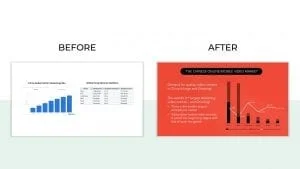
Redesigning charts, graphs and diagrams to match the style of the presentation can really elevate the presentation and give it a professional edge. In this example, I rebuilt the graph and modified it to give it a sleeker, custom look. For example, I chose to exclude the y-axis and labels, removed horizontal lines and the chart border. I also added data labels to highlight each data point since the y-axis is missing.
In this next example, I rebuilt the pie chart as a donut chart and added the clients logo to the center to match the presentation’s design style.
